It’s no secret that – on the global stage, at least – Huawei’s smartphone business was ripped to shreds after the Trump administration’s entity list restricted its access to US-related technologies and companies. But in the face of adversity, the Chinese tech giant has been quick to pivot its focus; investing and developing the other product categories it’s already involved with (as well as branching into new ones), including smartwatches.
The arrival of the Huawei Watch 3 (and Watch 3 Pro) is no coincidence. With the move away from Android – after losing support for Google Mobile Services on its internationally-released smartphones – Huawei doubled down on its efforts to build a platform of its own and what it came up with was HarmonyOS (a.k.a. ‘HongMengOS’ in China).
At the launch event for HarmonyOS 2.0 on 2 June 2021, Huawei unveiled a slew of hardware set to showcase the platform; including the Huawei Watch 3. The Watch 3 isn’t just a long-overdue successor to 2018’s Wear OS-powered Huawei Watch 2 though, for many it’ll likely be the first taste of HarmonyOS that users outside of China will come into contact with, so you’d hope it makes a good first impression.
Design and build
- Watch 3 and Watch 3 Pro sport distinct styles
- Excellent build quality and hardiness
- Interchangeable 22mm straps
While both the Watch 3 and Watch 3 Pro share in the same display size and design, the standard model sports softer lines and more rounded elements, while the Pro model opts for harder edges and bolder geometry.
The standard Watch 3 most closely resembles the rounded 42mm Huawei Watch GT 2, with a pillowed toughened glass front and tapered lugs; sharing in its predecessor’s support for quick-release 22mm bands and 5ATM water resistance.
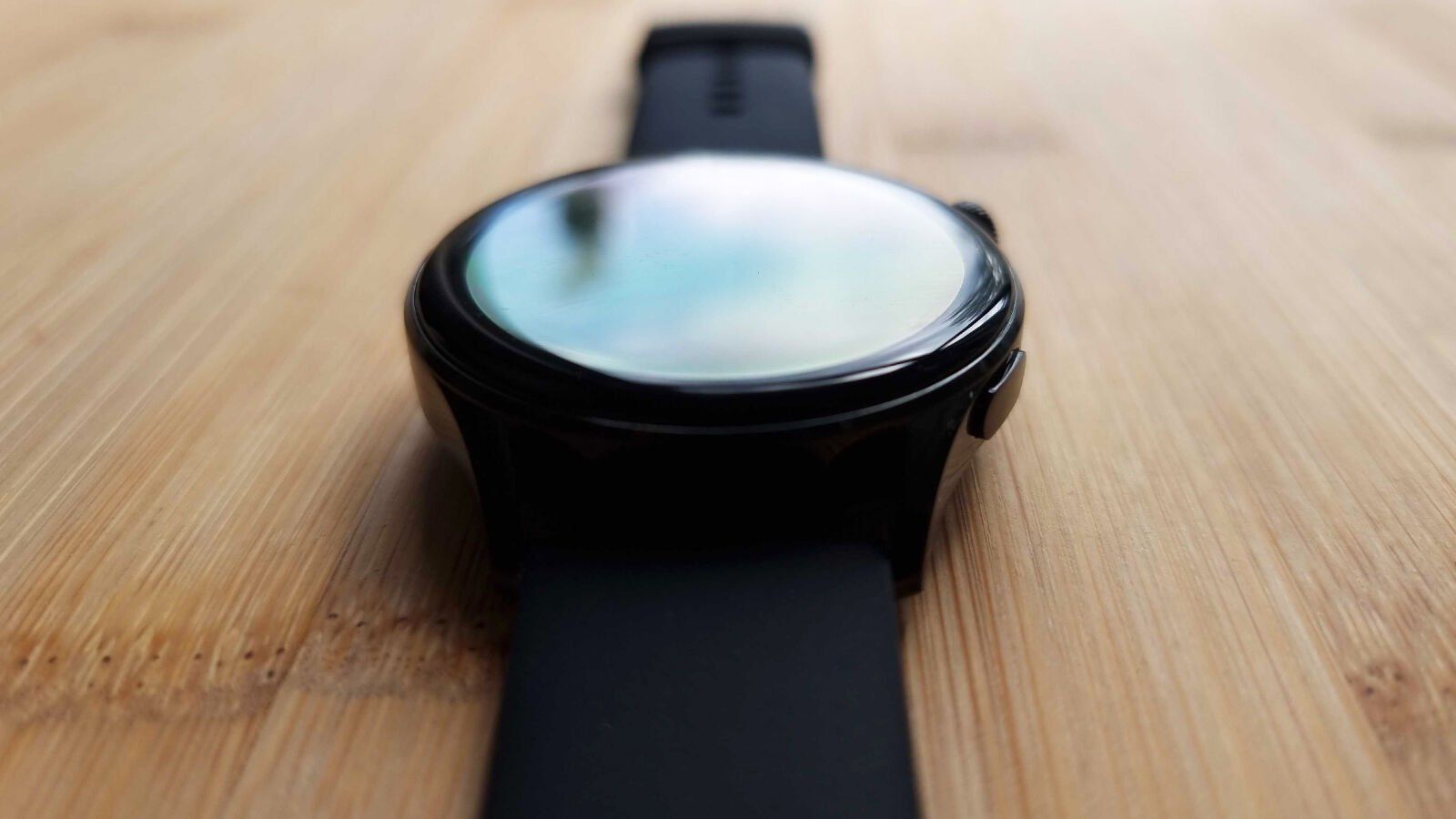
Despite similar lines, however, this generation of Huawei doesn’t actually include a smaller 42mm variant (as with the GT 2 line), meaning the ‘Active’ model of the Watch 3 – with its black casing and matching fluoroelastomer strap – is the lowest profile option of the lineup. There’s also a Classic and Elite version of the Watch 3 to consider, both of which feature a silver casing and either a brown leather or stainless steel link strap, respectively.
You’re not beholden to any sort of proprietary straps in either case but Huawei does sell its own line of EasyFit 2 bands that come in an assortment of colours, materials and styles, if you’re looking for a place to start with regards to personalising the look of your Watch 3.
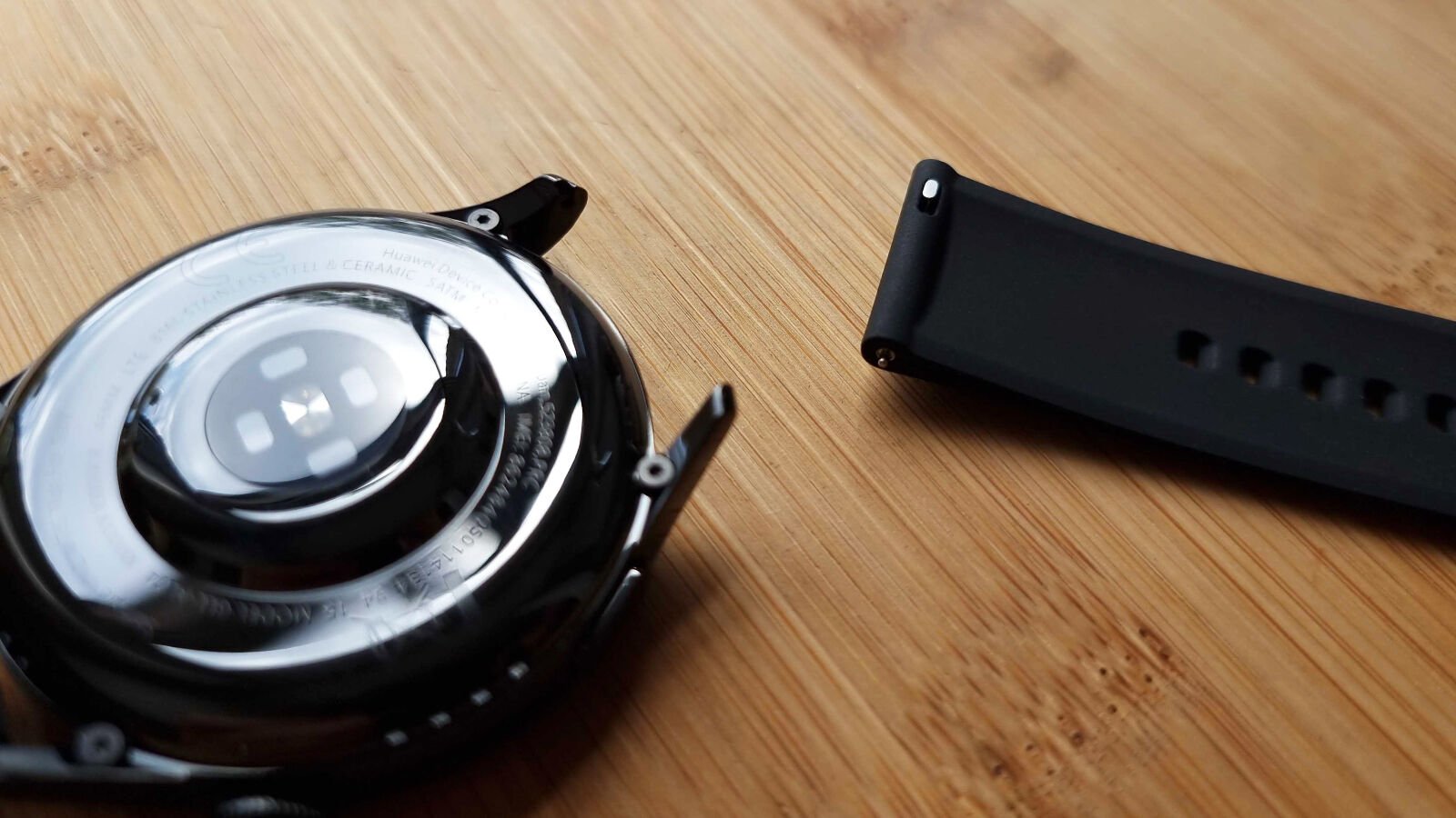
Going Pro means you trade up to sapphire crystal on the front, while the 316L stainless steel of the normal Watch 3 is replaced by more premium titanium alloy – not unlike 2020’s luxurious Watch GT 2 Pro.
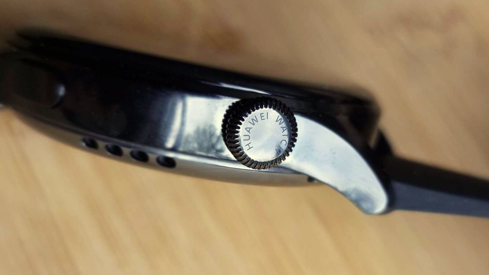
The big addition with this generation of Huawei smartwatch is the ‘3D rotating crown,’ which if you’ve seen or handled an Apple Watch, should be instantly familiar. Haptics lend credibility to this new means of interaction, with precise ticks and taps against your wrist when pressing and twisting the crown as a brilliant means of sensory feedback.
The assortment of LEDs, photodiodes and a sapphire crystal lens (collectively dubbed Huawei’s TruSeen 4.5 sensor) on the watch’s back facilitate constant heart rate monitoring, SpO2 (blood oxygen saturation) monitoring, help support sleep tracking and even constantly log skin temperature – something only really found in the consumer wearable space on the Fitbit Sense, right now.
Having lived with the Watch 3 for months, perhaps one of the most impressive aspects of its design is its hardiness. Despite repeated knocks, scrapes and drops (on laminate and linoleum, as well against wood, plaster and glass) the watch looks practically unscathed; in terms of both the metal casing and that pillowed cover glass, which even repels micro-abrasions with surprising confidence.
For a timepiece that isn’t marketed with any sort of ruggedisation or hardiness beyond its water-resistance/swim-proofing, the Watch 3 weathers incredibly well, even with daily wear.
Display and audio
- Bright, crisp AMOLED display
- Extensive display controls and features
- Disappointing microphone performance
Behind that cover glass sits a 1.43in circular AMOLED display, which promises an equally sharp 326ppi, on-par with the likes of both Apple’s and Oppo’s signature smartwatches. What’s more, in practice it’s clear, bright and colourful enough to glance at in bright outdoor conditions, without issue.
The watch comes with over 30 pre-loaded watch faces, providing plenty of variety, helped by the fact that many include animated elements and customisable complications. They all also possess some degree of always-on functionality that reflects their active design but enabling always-on mode does produce a warning that this feature can potentially cut battery life in half.

In fact, one of the nice things about the display experience is the level of transparency and control over its feature set; with the various installed watch faces all coming with power consumption ratings – so you know which will cause more drain at a glance before settling on one.
As well as always-on functionality, display settings also include a tilt-to-wake feature (which I preferred over always-on mode, even if it initially felt on the sluggish side), a torch, automatic and manual brightness control, and the ability to lock the screen to ‘on’ for a set period of time (up to 20 minutes, in five-minute increments).
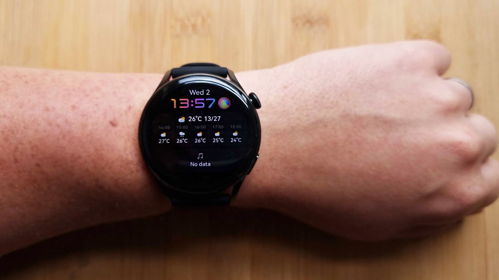
Additional watch faces can be downloaded from the paired Huawei Health app, which features its own curated store of both official and user-created watch faces, consisting of both free and paid offerings.
Audio
The Huawei Watch 3 also includes an integrated speaker, which is most useful when relaying pertinent health information during workouts – including pace and heart rate – usually every ten minutes, depending on the activity.
It offers surprisingly good clarity that can actually handle music (so long as the tunes in question aren’t too rambunctious), although I’d dissuade anyone from using the Watch 3 as a legitimate means of actually enjoying Doja Cat on the go.
Loudness for a smartwatch is decent too, but connect a pair of headphones via Bluetooth if you actually want to listen to tunes directly from the watch; whether they’re stored locally or you’ve swung for Huawei Music’s streaming service, which supports offline playback too.
The microphone experience – which you’ll likely most often use to interact with Huawei’s digital assistant, Celia – is a little less reliable; struggling to parse simple queries, like checking the weather or even recognising the “Hey, Celia” wake command on a consistent basis.
Software and features
- One of the first devices to run HarmonyOS 2 globally
- Heavily apes both Wear OS and watchOS
- On-wrist AppGallery app store
Just as HarmonyOS bears more than a passing resemblance to Android as it appears on phones and tablets, so too does its guise on the Watch 3; echoing aspects of both Google’s and Apple’s wearable platforms in terms of both look and feel. The approach may be unoriginal, sure, but some might find the end result richer for it, not to mention everything runs more smoothly compared to the likes of Huawei’s own Lite OS-toting GT 2 line.
Those familiar with Wear OS should feel at home with the layout of HarmonyOS 2 on the Watch 3; with the main watch face serving as a central hub, with features grouped into spokes running off in four directions.

The Celia assistant is a swipe to the right (or a button press away), notifications are uncovered with a swipe up, tiles – widgets that provide easy access to features like heart rate and weather – are brought in by swiping left (near-identically to Wear OS’s Tiles), while quick settings – including the torch feature and Find my Phone functionality – are hidden behind a swipe down.
The big departure from the Wear OS tropes comes with a press of that 3D rotating crown, which (by default, at least) brings up an apps grid that closely apes Apple’s watchOS grid view. Twisting the crown also allows you to zoom in and out of the grid, just as on an Apple Watch.
As for the app selection, the Watch 3 is absolutely brimming with features out the box; from a compass to a calendar, Huawei’s own Petal Maps, and there’s even a dedicated on-watch version of the AppGallery (Huawei’s app store) that supports third-party apps to expand functionality further – something the company’s Lite OS watches were often criticised for lacking in the past.

While most notifications don’t allow for any real interactivity, supported messaging apps – including WhatsApp – do let you respond on-wrist.
Text entry is surprisingly competent on the Watch 3, with an on-screen keyboard that impressed with its ability to understand which letters my sizeable fingertip was aiming for amidst the minuscule keys. Voice input and quick replies (which you can manage from the Huawei Health app on your connected smartphone) are also supported if you’d rather.
As for connectivity, as well as Bluetooth, the Watch 3 connects to WiFi (useful for streaming music or downloading apps from the AppGallery), as well as NFC – working in conjunction with loyalty cards and the like that you might have added to the Huawei Wallet app (although credit/debit cards don’t seem to be supported in the UK, where this model was reviewed).
Unlike Apple’s wearables, even the most modestly-priced variant of the Watch 3 comes complete with eSIM functionality built-in too, meaning buyers won’t have to fork out extra (beyond a compatible contract) if they want to go phone-free every now and then.
Fitness and tracking
- Over 100 trackable activities
- Tracks an impressive number of metrics
- Considered in-workout glanceable, pertinent metrics
The majority of the Watch 3’s rich feature set is focused on fitness and wellbeing. As mentioned earlier, it’s one of the only smartwatches beyond the Fitbit Sense out there with the ability to monitor skin temperature (a useful metric in stress detection), but it’s also equipped to track heart rate, SpO2 (blood oxygen saturation), sleep and more.

General daily fitness is broken down into a trio of key metrics; represented as blue, orange and red crescents (they’re not quite the Apple Watch’s rings but they certainly look familiar, regardless).
The Watch 3 logs your steps, activity and active hours throughout the day, with the aim of filling those crescent-shaped segments before the day’s end; an easy, glanceable way to keep tabs on your general activity over a 24-hour period. You can drill down to see even more metrics past the base crescents – like stairs climbed – too (the watch features a barometric pressure sensor to gauge altitude).
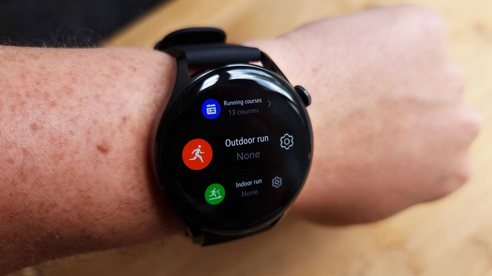
Looking for more specific workout tracking? There’s support for over 100 activities, including advanced tracking for 17 of those (called “professional” workout modes). Automated workout detection also isn’t bad; especially with simple walks, which you can specify as indoor or outdoor and log retroactively.
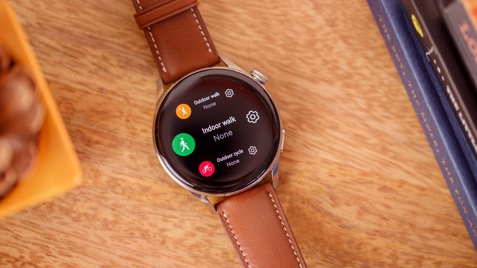
Depending on the activity, the Watch 3 displays current pertinent metrics, like heart rate, pace and workout intensity, and even throws out audio updates, such as how long you’ve been working out and other key metrics you might like to keep tabs on, without having to glance down.
Performance and battery
- Responsive UI
- Promising longevity
- Ongoing bugs undermine user experience
Similarly to the likes of the Oppo Watch, the Watch 3 relies on a dual chipset architecture to balance high-end performance against power efficiency. The Pro model also boasts more accurate dual-channel GPS; a rarity in the wearable space and a feature the company first implemented inside the Kirin 980 chipset powering its Mate 20 series smartphones.
From the moment you power the Watch 3 up, the most evident departure from its direct predecessors (in the GT 2 series) is how quick and responsive everything feels.

HarmonyOS 2 on the Huawei Watch 3 not only looks like a more premium smartwatch user experience than we’re used to from the company’s timepieces, it feels like one. That’s thanks, in part, to snappy animations and low touch latency; making for the most premium wearable experience Huawei has put out to date.
The caveat here is that – in its current state, at least – there are still fundamental issues that even months after release still haven’t been addressed. Bugs include alarms failing to go off, tracked workout seemingly ending without warning and both timers as well as the watch face itself all having frozen numerous during the review period, despite several rounds of updates.
on occasion, undermining the fundamental functionality…
