Microsoft first revealed the Surface Duo back in October 2019, but it hasn’t been smooth sailing. The original model took almost a year to be released in the US, and several months longer elsewhere including the UK.
By the time it finally came to market, the first-gen device was almost destined to fail. Its outdated Snapdragon 855 processor came without 5G, while a 60Hz display and just one 11Mp camera didn’t win many suitors.
That’s before you consider chunky bezels and a questionable software experience, all at a price that made the device very unappealing. And that’s without even comparing it to rivals from Samsung and Huawei.
Microsoft has focused its attention on getting the hardware right this time around – the Surface Duo 2 is a huge upgrade over its original, and is already available in several countries around the world. But the software experience is what will ultimately determine the Duo 2’s fate and, well, it’s not good news.
Design & Build
- Two 5.8in displays, total screen area 8.3in
- New triple rear camera module
- Premium design and build
The Surface Duo 2 has the same basic form factor as its predecessor, consisting of two displays attached via a strong hinge. Near-identical dimensions disguise the fact that Microsoft has managed to increase the screen sizes here. I’ll talk about the quality of these screens in more detail in the next section.
It’s easy to understand how Microsoft has managed to increase the display size without significant changes to the total footprint of the device. The Duo 2’s bezels are noticeably smaller than the original, making it feel more premium and futuristic than before.
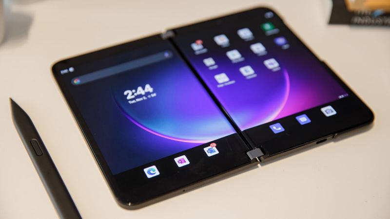
They’re nowhere near as slim as you’ll find on modern smartphones, though – you still need room for a tough metal hinge above and below to connect the displays.
This feels impressively robust, reinforced by aluminium that extends down the back of the phone where the screens meet. At no point throughout my testing did it feel anything but strong and sturdy – that’s a testament to Microsoft’s engineering.
Having a 360-degree hinge you can rely on makes the Duo 2 impressively versatile. Microsoft officially advertises five key modes: regular Book (both in portrait and landscape), Compose (with the bottom screen used as an on-screen keyboard), Single screen and Tent (pictured below). Each has its own strengths and weaknesses, but it’s great to have so many potential use cases within one device.

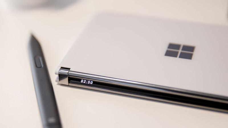
Even when the Duo 2 is closed, you can still check key information. The inside of each display curves slightly at the edges, meaning it’s just about visible from the outside. Microsoft is calling this feature a “Glance Bar”, but there are two big caveats here.
Firstly, there’s no raise to wake functionality – you need to press the power button for it to show up. You’re also currently limited to incoming calls, messages, current volume and battery percentage. Support for app notifications would make it much more useful.
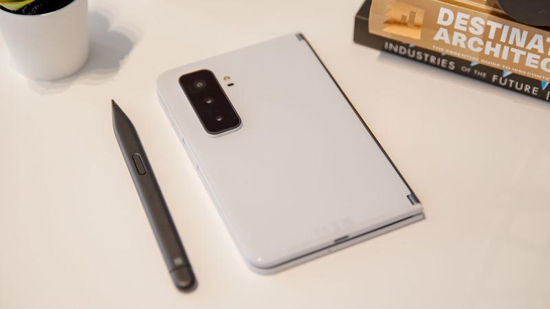
One of the big upgrades on the Duo 2 is a new triple rear camera setup. They’re housed within a large module that protrudes significantly from the back of the phone. Without any rear cameras, this wasn’t an issue for the original Duo, but I’d much rather deal with this minor inconvenience.
Aside from a slight wobble when face down on a table, I had no other problems with it – as you’ll see from the camera section, both these and the 12Mp selfie camera were worth including.
However, the latter doesn’t support face unlock of any description. It means you’ll have to rely on the fingerprint sensor built into the power button, but this was fast and responsive throughout my testing.
This rear camera module is the defining feature on the back of the device. In fact, the glossy Microsoft logo on the other screen is the only other element worth noting. It tends to pick up fingerprint smudges, but that’s less of an issue elsewhere on the glass exterior. I can only comment on the Glacier White model tested, though – there’s also a new Obsidian Black option.
However, even when closed, the Surface Duo 2 is still a bulky device. As well as being much wider and around twice as thick as regular smartphones, it weighs in at a hefty 284g – that’s up from 250g on the original Duo. You could argue that you’re getting two screens for that, but it’s undoubtedly less portable than almost every other smartphone. Storing the Duo 2 in your pocket is still possible, just much less comfortable.
Ports are also kept to a minimum – there’s a single USB-C port, plus space for just one SIM card. A 3.5mm headphone jack would have been nice, but it’s far from a priority these days. The device technically has waterproofing, but it’s the bare minimum IPX1 standard. This allows for vertically falling drops equivalent to 1mm rainfall for 10 minutes, so offers little protection.
You may also notice the stylus in many photos – that’s the Surface Slim Pen 2. It’s available as an optional extra, but compatible with all recent Surface devices. However, my review unit didn’t include a stylus, so I can’t comment on how effective it is.
Display
- 5.8in AMOLED displays
- 90Hz adaptive refresh rate
- Great viewing experience
The design elements mentioned above are all important, but they’re ultimately a supporting cast to the main event – the display. As the name suggests, the Surface Duo 2 has two of them, although both are now 5.8in instead of 5.6in on the original.
When fully open, that gives you a total screen area of 8.3in – the same as you’ll find on the latest iPad mini.
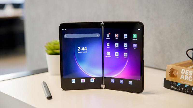
Of course, being split across two screens makes for a very different user experience. You also get two key features you won’t find on Apple’s tablet – an AMOLED screen and 90Hz refresh rate.
The latter is new to the Surface Duo, and it has the same effect as on a regular smartphone. Visuals are fluid and buttery-smooth, especially while scrolling social media or browsing the web.
This is an adaptive refresh rate, meaning it increases and decreases according to the situation. The most noticeable drop is when content is moving between the two displays, but it wasn’t too much of an issue.
Each screen has a 1344×1892 resolution and boxy 4:3 aspect ratio, making for a total display area of 1892×2688.
Both panels are crisp and detailed, equally capable of vivid colours and deep blacks. The Surface Duo 2 also gets impressively bright – I recorded a maximum brightness of 696 nits, meaning regular outdoor use shouldn’t be an issue.
For those occasions where you’d like to use just one screen, the Duo 2 will prioritise the right display. This feels the most natural, although double tapping on the left screen lets you switch.
Specs & Performance
- Snapdragon 888 processor (5G built-in)
- 8GB RAM
- Excellent performance
- Entry-level 128GB storage may not be enough
Some of the Surface Duo’s big problems were under the hood, but Microsoft has put that right with its successor. Qualcomm has released two flagship chips since the Snapdragon 888 that powers the Duo 2, but it still delivers the top-level performance you’d expect. It also has 5G built-in, something Microsoft wasn’t able to include on the original model.
Alongside the Adreno 660 GPU and 8GB of RAM across all configurations, performance is predictably very good. Basic use cases such as web browsing, instant messaging and social media aren’t a problem for the Duo 2, but it was the multitasking experience that particularly impressed me. Even demanding apps can run side-by-side without issue.
Solid performance extends to mobile gaming, where even the most in-depth titles on the Play Store run smoothly. I tested Call of Duty: Mobile, Asphalt 9 and FIFA Mobile with no noticeable slowdown or lag. The back of the Duo 2 soon becomes warm to the touch during these tasks and while charging, but it’s nothing more than a minor inconvenience.
However, opening and closing apps can cause problems. That’s where I noticed hesitation and stuttering at times, while some apps crashed when trying to open them across both displays. But it didn’t feel hardware-related, just a case of software that’s not optimised to run on dual-screen devices. I discuss this in more detail in the following section.
Overall, the Surface Duo 2 delivers impressive performance in almost all areas. That’s reflected in the benchmarks below, which put it roughly in line with the best foldable phones available right now:
However, using the cheapest model I tested may cause issues with regard to internal storage. It offers just 128GB, with no option to expand with a microSD card. If you think that might be a problem, you’ll need to pay extra for 256- or even 512GB.
It’s also worth highlighting the presence of NFC here, something which was missing from the original Duo. For most people, its main purpose will be contactless payments using Google Pay.
Given the need for large bezels, there’s space for dual stereo speakers, in addition to the earpiece. This makes for a great audio experience that’s far superior to what you’ll find on most smartphones, offering a rich sound with a decent amount of bass.
It also means the calling experience is impressive, even if you probably won’t be holding the Duo 2 up to your ear. Dual mics mean the person on the other end can hear you loud and clear, too.
Software & Apps
- Microsoft’s skin over Android 11
- No word on upgrade to Android 12 (or Android 12L)
- Software very buggy, many apps not optimised for dual screens
The Duo 2 is the only Surface device that doesn’t run Windows, with Microsoft opting for Android instead. This makes sense, given it’s designed to replace your smartphone and Windows Phone is a thing of the past. However, the Surface Duo 2 is still running Android 11 at the time of writing, with no word on when it’ll get the update to Android 12.
It’s taken 16 months after release for the original Duo to get Android 11, so we may still be waiting a while.
As you might expect, the software experience here is very different to what you’ll find on Pixel phones. Microsoft has put its own stamp on Android, not least in the extra apps that come pre-installed.
The company clearly wants you to use the likes of Edge, Outlook and OneNote as defaults – none of them can be uninstalled. These can easily be swapped out for Google’s equivalents, but it’s disappointing to have extra bloatware when storage is already limited.
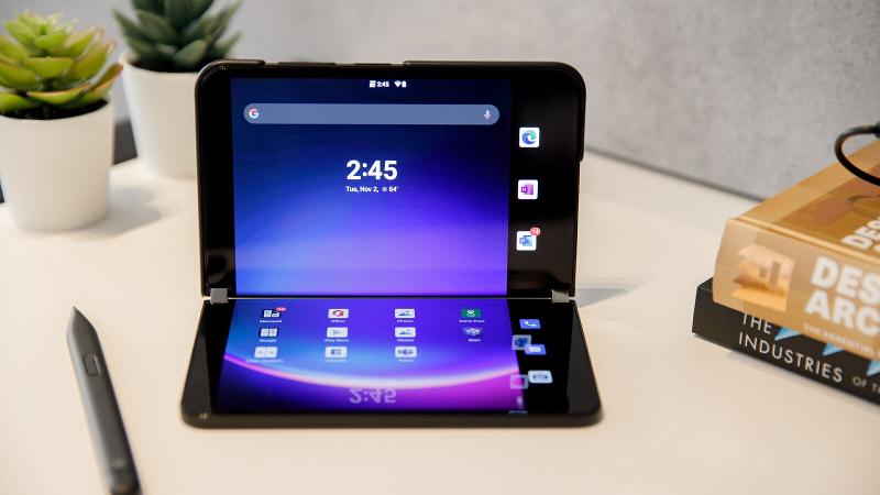
However, the bigger issue here is Android’s lack of optimisation for the Duo 2. Microsoft’s own apps work fine, but many of those on the Play Store simply aren’t designed to run across both screens. Many apps I tried opening in dual screen mode either turned the screen black or crashed completely.
Even for apps that did run as intended, crucial information is often obscured by the hinge. This makes reading an online article or browsing social media more annoying, but it’s a big disadvantage while gaming. The dual-screen experience also feels forced at times, with the left display showing information that simply isn’t necessary for the task at hand.
Nonetheless, when you do find an app that is designed to make the most of the Duo 2, the experience is excellent. That’s the case when reading using the Kindle app, while Asphalt 9 puts controls on one screen and the action on another. Both made the device feel fun and intuitive, something that’s often not the case elsewhere.
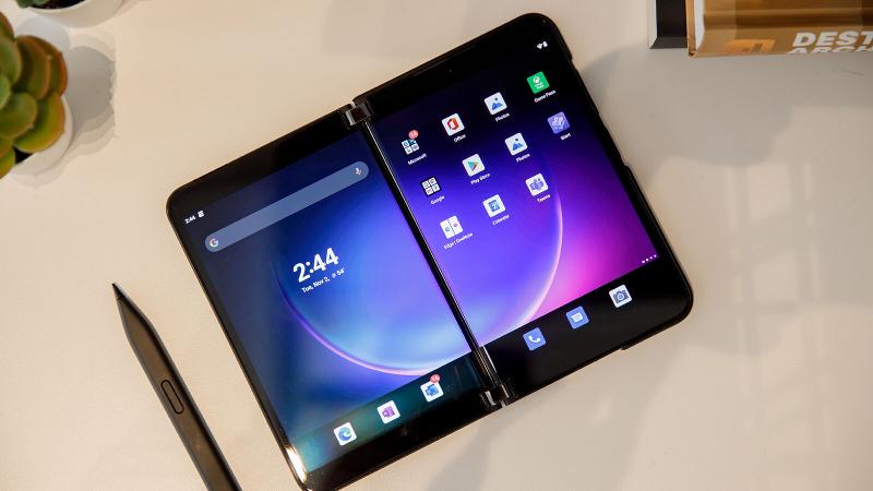
Of course, one area the Surface Duo 2 excels is multitasking. Opening two apps side-by-side makes a lot more sense here than regular smartphones, especially when you can save custom presets of pairs. However, there’s no option to display three or more apps at the time, like you can on Windows. I’d like to see multitasking functionality expanded in the future.
In theory, many of the Duo 2’s main issues could be solved with a software update. That makes me genuinely optimistic for Android 12L, a version of Android specifically designed for foldables and tablets.
Only a handful of tweaks have been revealed by Google so far, but it could dramatically improve the Surface Duo 2 software experience in the future.
Cameras
- New wide, ultrawide and telephoto rear cameras
- Small upgrade to front camera
- Decent photos, but not best-in-class
For some reason, the original Surface Duo didn’t have any rear cameras. Microsoft has emphatically put that right here, with a new triple camera system. A main 12Mp sensor is joined by 16Mp ultrawide and 12Mp telephoto lenses, mirroring what you’ll find on many modern smartphones.

Stills from the Duo 2 are nothing special, but offer decent dynamic…
