Samsung’s August Unpacked event was something of a transformative affair, with the Z Fold 3 acting as a stand-in for the Galaxy Note line, while the company’s new Galaxy Watch 4 family served as the debut for Google’s jointly-revitalised Wear OS platform.
Not since 2014’s Galaxy Gear Live has a Samsung smartwatch run on Google’s wearable operating system. In the interim, the Korean company has forged ahead with its own Tizen OS; landing itself the number two position in the global wearables market while Wear OS was relegated to the platform of choice for lesser-known manufacturers and newcomers.
As such, the Watch 4 line doesn’t just demonstrate Samsung’s proficiency in creating compelling smartwatches but the company’s ability to collaborate and reshape an unloved rival platform into something that users may actually come to embrace.
Design and build
- Classic follows more traditional watch styling
- Rotational input via physical bezel
- Supports third-party straps
- Elegant yet hardy
Samsung hasn’t used the ‘Classic’ naming convention since its smartwatches bore the ‘Gear’ name, however, the Watch 4 line reestablishes the trend with two distinct styles, manifesting in the Watch 4 and Watch 4 Classic.
The ‘Classic’ name speaks to this watch’s more traditional styling and design influences – swapping out the standard Watch 4’s contemporary geometry and flat glass front for a timepiece that leans more heavily on the aesthetics of a typical mechanical watch.
While the sensor placement, buttons and screen remain consistent across both styles of Watch 4, the Classic sports a more substantial stainless steel casing and – more importantly – a physical rotating bezel in place of the standard model’s touch-based alternative.
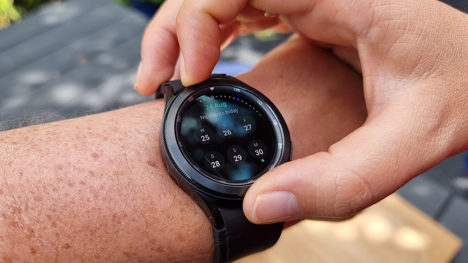
Like the Apple Watch’s Digital Crown, the physical bezel acts as a means of rotational input and the satisfying ‘clunk’ that it provides each time you twist it adds a pleasing level of tactility that you don’t get with the haptic feedback of the virtual alternative on the standard Watch 4.
Similarly to last year’s Galaxy Watch 3, the Classic can be had in two casing sizes: 42mm and 46mm, with both being notably heavier and thicker than the sleeker aluminium-bodied Watch 4. The standard model comes in four colours (across both casing sizes), while the Classic comes in just two: either black or silver, regardless of casing size.
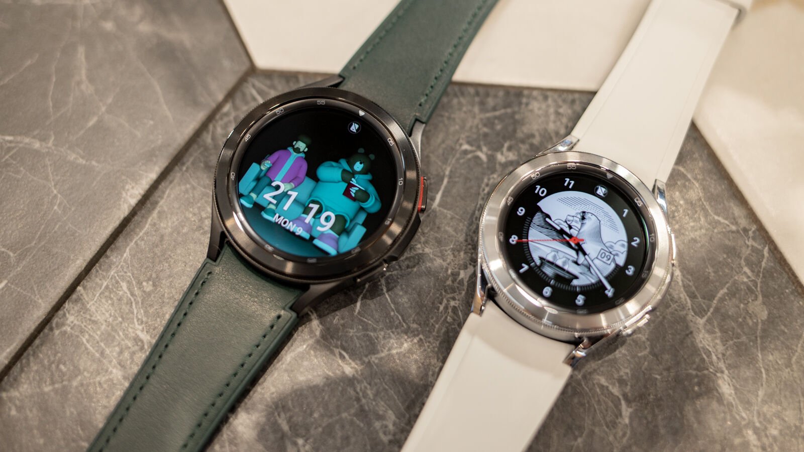
The smaller 42mm Watch 4 Classic (tested here) also happens to be the thickest entry in the line (at 11.2mm), however, the variant’s added weight and thickness – compared to the standard models – doesn’t really translate into real-world wear; still feeling like a relatively unobtrusive smart timepiece that looks the part. All I would say, with regards to its proportions, is that the 46mm model makes for a better fit on my near-7in/17cm wrists, compared to the smaller casing size featured in this review.
By default, the Watch 4 Classic comes pre-fitted with the Galaxy Watch 4 Ridge-Sport Band, however, in markets where the Samsung Design Studio is available, buyers can pick their band type, size and colour at purchase, which also includes the option of the Sport, Hybrid Leather and Extreme Sport Bands too. Bands can also be bought separately, so you can mix and match as desired.
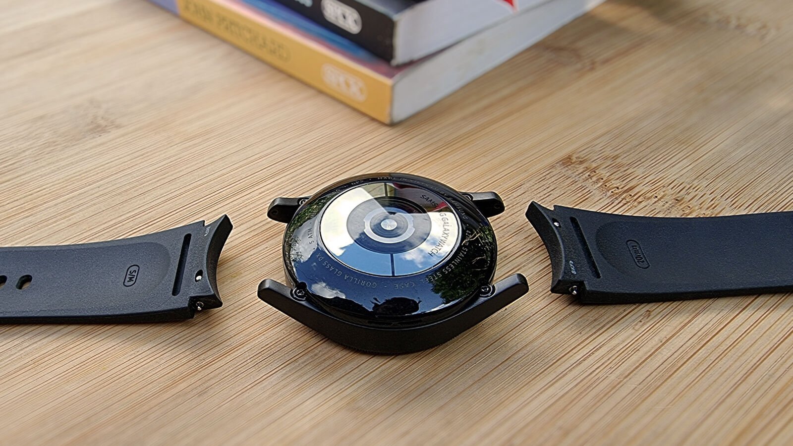
You’re not restricted to Samsung’s proprietary quick-release bands either, although the unique crescent shapes on their ends hug the curves of the Watch 4’s body more seamlessly than you’ll find with a generic straight-ended strap.
Like the Watch 3, there are two physical buttons on the Classic’s right side (although they’re less prominent and rectangular, rather than round), with a red accent surrounding the edge of the top button. The hardware here is also IP68 dust and water-resistant, swim-proof up to 5ATM and MIL-STD-810G certified (which tests against extreme temperatures, shock and the like); repelling scratches and nicks surprisingly deftly too.
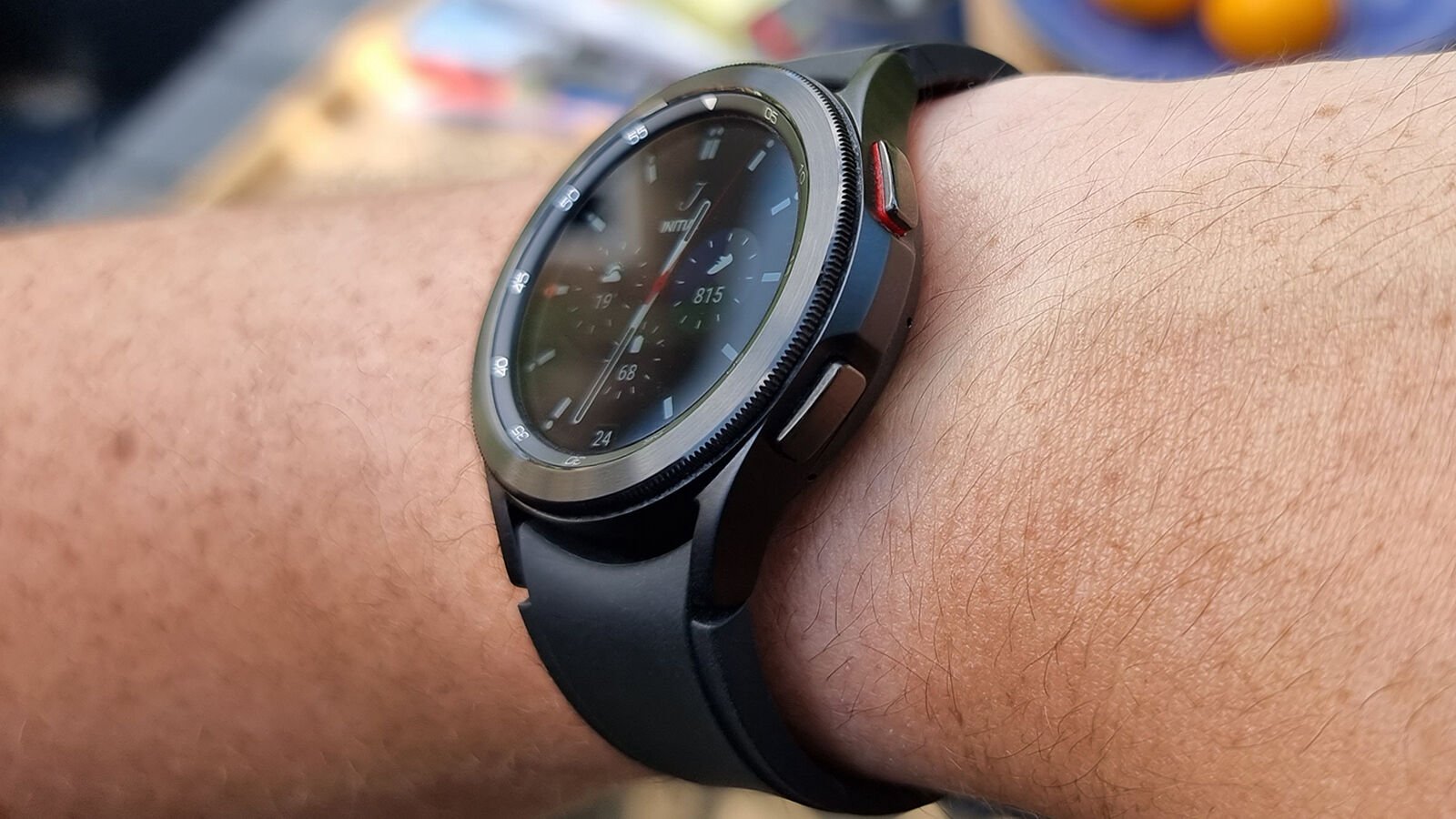
The only main gripe about the Classic’s design is that dust tends to accumulate at the point where the rotating bezel meets the display and some marks proved difficult to remove from the surface of the included Ridge-Sport Band. Beyond that, however, the Watch 4 Classic felt nothing but comfortable and stylish to wear when both working out and going out.
Opt for the Classic if you’re after a smartwatch that looks more watch than wearable tech and if you think you’ll appreciate the greater level of tactility offered by its physical bezel, otherwise the contemporary stylings of the standard Watch 4 might make for a better fit.
Display and audio
- Beautifully crisp display
- Rich always-on watch face options
- Responsive tilt-to-wake
- Bluetooth audio support
Two casing sizes means two display sizes too, with the 42mm build sporting a 1.19in 396×396 circular screen and the 46mm version toting a 1.36in panel, with a 450×450 resolution – resulting in comparatively crisp pixel density across both sizes. These are identical to the displays found on the 40mm and 44mm standard Watch 4’s respectively, too.
The Super AMOLED panels used deliver a rich viewing experience, facilitated by excellent contrast and wonderfully vibrant colours, while the use of OLED tech means they’re ideal for supporting the watch’s always-on display functionality too.
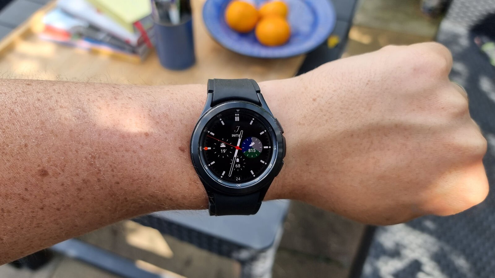
In terms of control, Samsung has gone above and beyond expected features – like automatic and manual brightness control, its various screen wake settings and screen timeout options – including extras like enhanced touch sensitivity for use with gloves and a wealth of accessibility features, including colour and magnification controls.
There are over 20 watch faces available on-watch out the box, practically all of which feature some degree of personalisation or customisation, such as complications that convey additional information like steps, weather, battery percentage and more. If you want even more faces, they can be downloaded directly on-watch, straight from the Google Play Store.
Tilt-to-wake felt pleasingly responsive to the point that – outside of testing – I felt no need to switch on the always-on display, however, it’s there for those who prefer such functionality (at the expense of some longevity).
In most cases, always-on faces retain an impressive amount of information compared to their standard iterations, with most only dropping more demanding elements (such as a constantly animated second hand) while still delivering colour and detail that you might otherwise expect to fall by the wayside.
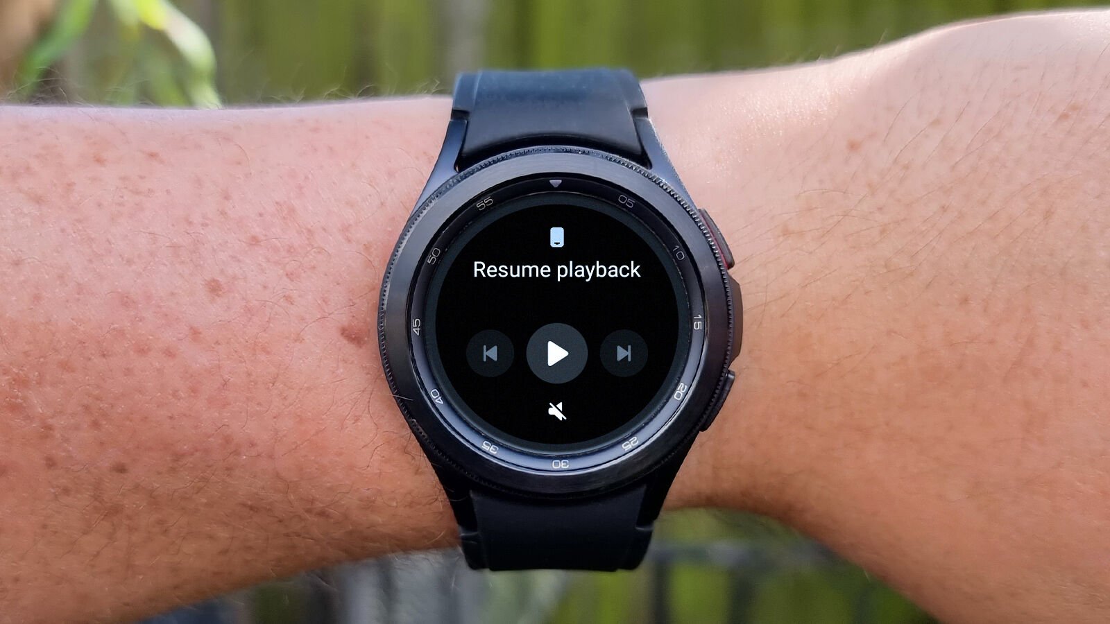
The Watch 4 Classic also supports direct Bluetooth audio pairing, which works simply enough with most Bluetooth headphones, but can start to fall apart more readily than a connection to your smartphone if there’s significant interference or obstruction between buds and watch.
An integrated microphone and speaker also feature, with surprisingly good performance – in terms of firing queries to the assistant or taking calls directly on the watch. The speaker is clear but lacks any sort of bass – which isn’t surprising given the tiny amount of room Samsung is working with here – making it a functional inclusion but certainly not one to enjoy music with.
Software and features
- ‘Wear OS powered by Samsung’ feels slick
- Exclusive Wear OS features at launch (like offline Spotify playback)
- Rich app and watch face ecosystem
- No access to Google Assistant (at launch)
Wear OS – Google’s long-standing but unloved wearables platform – has only ever really existed as an awkward background character in the smartwatch space, while Apple’s watchOS and Samsung’s Tizen-based wearables have held the spotlight.
In something of a surprise move, Google announced its partnership with Samsung on the next iteration of Wear OS back at Google I/O 2021, and the Watch 4 and Watch 4 Classic are the first smartwatches to market that represent the fruits of this newly-minted tag team.
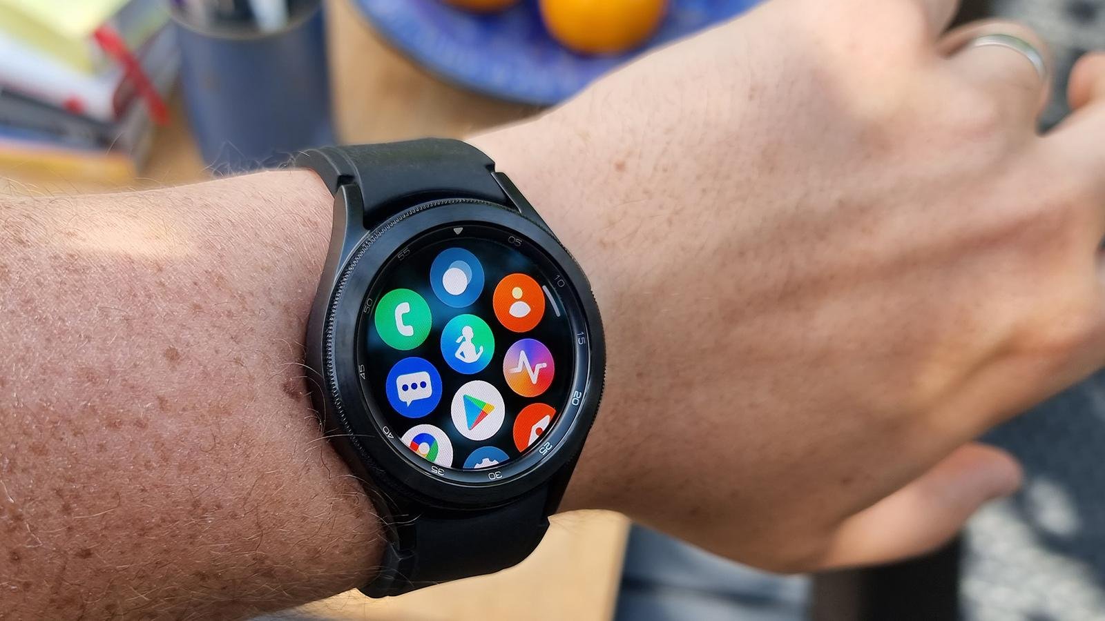
That said, it’s definitely Samsung steering the ship with regards to the Wear OS experience that the Watch 4 line offers up; so much so, in fact, that this isn’t Wear OS 3 as it’ll appear on smartwatches from other manufacturers down the line but rather ‘Wear OS powered by Samsung’, with the company’s own One UI Watch interface design on board too.
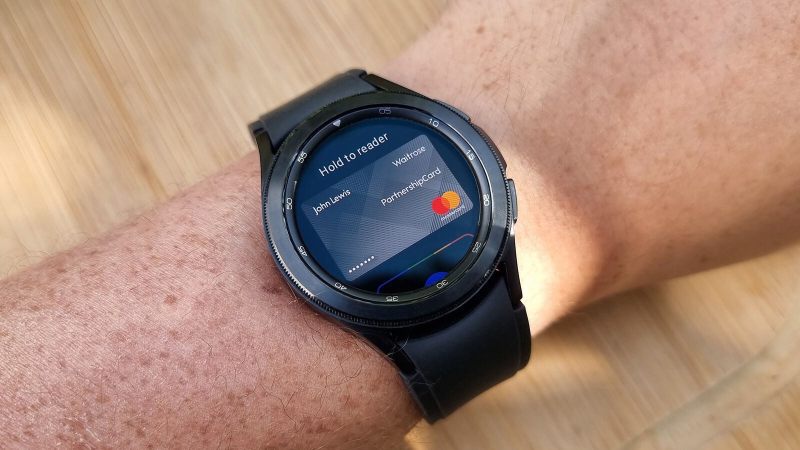
As such, while those who’ve used Wear OS watches in the past will recognise that apps come from the Play Store and Google-made offerings like Google Fit and Google Maps are supported too (something previously not possible on Samsung’s Tizen-powered watches), the voice assistant (at launch, at least) is solely Samsung’s less-capable Bixby, Samsung Pay is the only NFC payment app accessible by hardware shortcut (even if you have Google Pay set up) and a number of other apps and icon designs mirror that of One UI, as it appears on Samsung’s phones.
Even though you can pair the Watch 4 series with any compatible Android smartphone, two of its biggest health features (more on those later) are locked to Samsung Galaxy phones, specifically. So while this is the latest and greatest Wear OS watch yet, only Samsung Galaxy smartphone owners will truly benefit from its full feature set.
Speaking of feature set, the Classic serves up obvious entries like a calendar, contacts, phone, messages, weather, timers, alarms and the like, alongside some more specialist offerings, such as a compass, voice recorder and Samsung Pay. As with watch faces, apps are now sourced from the Google Play Store, addressing perhaps one of the biggest shortcomings of previous Galaxy Watches – third-party app support.
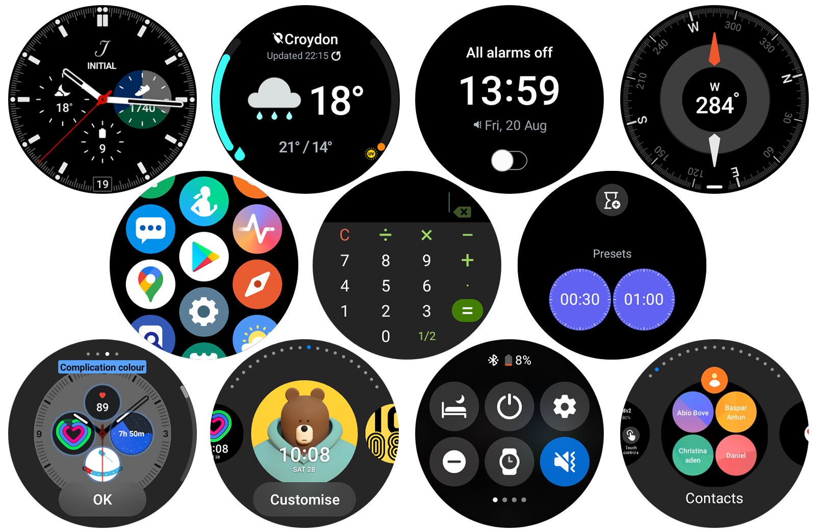
Assisted by Google’s renewed focus on making Wear OS a success, the Watch 4 and Classic gain access to a host of new apps; some previously unavailable to the company’s Tizen-based watches and some that are completely new to Wear OS itself, like YouTube Music.
Companies like Spotify have also promised new functionality (initially exclusive to the Watch 4 line) in offline playback support, which reinforces the industry’s reawakened awareness of Wear OS and Google’s/Samsung’s efforts to try and ensure the platform remains capable and competitive.
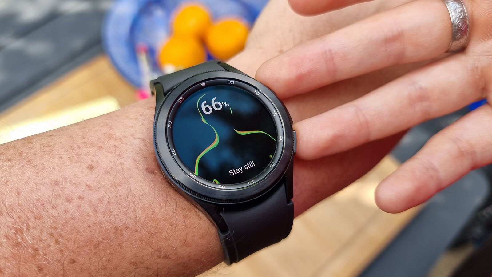
Wear OS’ Tiles finally find purchase on the Watch 4 and Classic too. Essentially widgets – available to the right of your chosen watch face – Tiles have been part of Wear OS since 2019, however, it wasn’t until earlier this year that Google opened Tiles up to third parties and Samsung has made sure to include Tiles for all of its key experiences; from timers to weather, working out and alarms.
For those familiar, it’s arguably one of the most consistent UI elements to carry over from Sammy’s Tizen-based smartwatches and better yet, they’re intuitive to work with; easily added, removed and reordered on the fly.
Fitness and tracking
- Samsung Health offers well-rounded tracking
- Separate Samsung Health Monitor app is needed for full functionality
- Some features are Samsung Galaxy phone-exclusive
- Detailed health and sleep tracking (thanks, in part, to BIA sensor)
What Samsung calls its ‘BioActive Sensor’ is really an umbrella term for the multitude of sensors that the Watch 4 Series possesses; tracking metrics including heart rate and blood oxygen.
The ECG feature and Afib (irregular heartbeat) detection – which took time to find approval on the Watch 3 (and Watch Active 2) – are available from the get-go on the Watch 4 line (market dependant), while this year’s wearable also debuts a new BIA (bioelectrical impedance analysis) sensor, which adds body composition analysis to the Galaxy Watch’s already long list of fitness and wellbeing features.

In a similar fashion to most smart scales, by gently holding your ring and middle fingers against the buttons on the side of the Watch 4’s casing, you’ll be served a number of new metrics; including body fat percentage, skeletal muscle weight, BMI and more.
As ever in the consumer wearables space, metrics like this are only ever meant to serve as a handy guide and don’t constitute as medically approved data, however, for fitness fanatics that hold value in ‘the quantified self’, the Watch 4/4 Classic’s body composition analysis feature is an impressive new addition to have on a wearable.
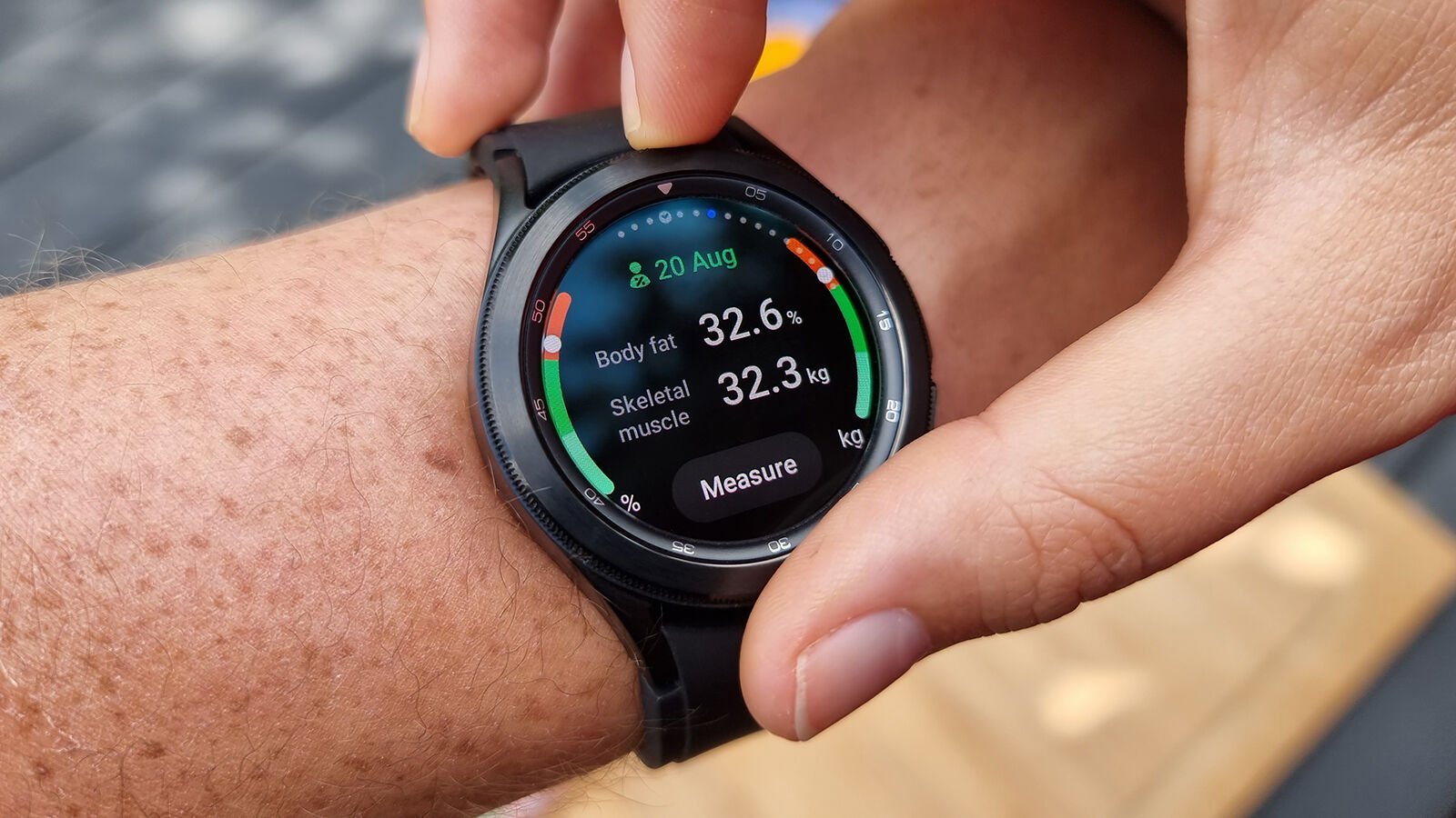
There was some divergence when compared to the results from my Withings Body+ smart scales, however, not so much that the data was rendered useless (Body Water percentages showed the biggest discrepancy but even those only deviated by about 3%).
With the exception of ECG and blood pressure functionality, which (somewhat frustratingly) operate via a separate Samsung Health Monitor app (that only works on…
